


Featured Posts


Fashion
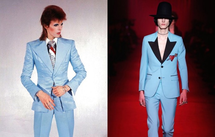
How Vintage Clothing Influences Modern Fashion
Vintage clothing, with its unique aesthetic and nostalgic allure, significantly shapes contemporary fashion trends. This article explores this influence, examining how past styles are…

Women Fall and Winter Fashion 2022-23: Comfortable Elegance
The upcoming fashion seasons are everything women could hope for. Who does not dream about always being dress elegantly, yet comfortably so? That is…

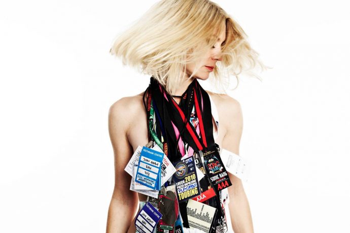
A Modern Guide To Mod Clothing
Mod is a style of fashion first popularised in England during the 1960s – it was a subculture in the UK that was influenced…
Music & Bands

How Do You Get Started as a DJ?
Beginning Your Journey as a DJ If you’ve always wanted to DJ, the first thing to remember is that nothing is stopping you and…

1Direction Band Members Celebrate 8 Year Anniversary
Believe it or not, it’s now been eight years since popular boy band One Direction first started up. The English-Irish pop group consisting of…

U2: Never Stop Never Stopping
In talking about classic rock revival and continuation, I often find myself drawn back to the amusing film title from 2016, Popstar: Never Stop…
Lifestyle

A Guide On How To Host A Memorable Corporate Event
Hosting a memorable corporate event can be beneficial for your business. It can do almost everything from boosting morale amongst the team to increasing…

How To Give a Gift in Style: 4 Useful Tips
Whether you’re a fan of gift-giving or not, it is something that follows us through life. Do you ever find yourself struggling to pick…

What Are the Benefits of Virtual Team Building?
The restrictions imposed on us due to the coronavirus pandemic has meant that many of us are now working from home. While this can…
Inspiration

How to Reduce Inflammation in the Body
Inflammation is a natural response of the body to harmful stimuli, such as infections, injuries, or toxins. While short-term inflammation is a healthy process,…

How You Can Look 10 Years Younger
Age is a funny thing. It can sneak up on you when you least expect it and even though you may feel young at…
The Benefits Of Getting A Hair Transplant
When it comes to getting a hair transplant, many people still shy away from the topic or even feel embarrassed about getting it done,…
B & R Favourites

8 ways to kick your cigarette habit
Cigarette smoking harms every part of your body. The notion that only your lungs are harmed is only a myth. Smoking habits lead to…

Emma Graceland / #summerslayin
This week, I was lucky enough to interview Emma Graceland, an influential and frankly stunning UK fashion and beauty blogger who amongst her many achievements is…

Fizzy Robot Photography – Fur, Cocktails and Knickers
Fizzy Robot Photography is the kind of outfit we like to support here at Beauty & Ruin Magazine – they’re a local startup with…
Latest By Format
Latest Articles
Unlocking Your Potential: How Golf Tuition Holidays Can Improve Your Game
The pursuit of excellence in golf is a meticulous journey often fraught with nuances that can elude even the most dedicated players. Golf tuition…
Read More
How Vintage Clothing Influences Modern Fashion
Vintage clothing, with its unique aesthetic and nostalgic allure, significantly shapes contemporary fashion trends. This article explores this influence, examining how past styles are…
Read More
A Guide On How To Host A Memorable Corporate Event
Hosting a memorable corporate event can be beneficial for your business. It can do almost everything from boosting morale amongst the team to increasing…
Read More
How to Reduce Inflammation in the Body
Inflammation is a natural response of the body to harmful stimuli, such as infections, injuries, or toxins. While short-term inflammation is a healthy process,…
Read More
Women Fall and Winter Fashion 2022-23: Comfortable Elegance
The upcoming fashion seasons are everything women could hope for. Who does not dream about always being dress elegantly, yet comfortably so? That is…
Read More
A Modern Guide To Mod Clothing
Mod is a style of fashion first popularised in England during the 1960s – it was a subculture in the UK that was influenced…
Read More
How to Wear Y2K Fashion in 2022
Do you remember what you wore at the beginning of the 2000s? Maybe you still have some fashion items hidden in your wardrobe that…
Read More
How to Dress like A Pro: A Fashion Guide for Women Playing Golf
Are you a newbie golfer, someone who just started playing or perhaps an avid player who is looking to take your game to the…
Read More
How to Dress Like a Pro: A Fashion Guide for Men Playing Golf
Golf is a game of style as well as skill. When you’re playing on courses that cost hundreds of pounds to access, it’s imperative…
Read More